A box plot conveys a lot of information and can be a very powerful tool. Excel does not generate these as part of its basic funtctions and I have never found time to learn how to do this in R or
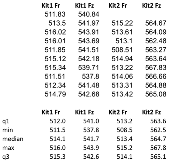
Gather your data togather in columns, with labels on the top.

Calculate the fllowing:
Quartile 1: =QUARTILE(K4:K13,1) this returns the 25th percentile of the data in K4 to K13 of your table.
Min: =MIN(K4:K13), this returns the smallest of the numbers in K4 to K13.
Median: =MEDIAN(K4:K13), returns the median of the numbers in K4 to K13. The median is the number in the middle of a set of numbers; that is, half the numbers have values that are greater than the median, and half have values that are less.
Max: =MAX(K4:K13), this returns the largest of the numbers in K4 to K13.
Quartile 3: =QUARTILE(K4:K13,3) this returns the 75th percentile of the data in K4 to K13 of your table.

Creating the box plot chart:
Highlight the calculation table and its headers (the data in the image above) and create a “Marked line” chart. You will then need to highlight the chart, right-click and “select data” then click the “Switch Row/Colum” button. Now you are ready to format the chart to create box plots as your data are in teh correct format with q1, min, median, max and q3 plotted for each column.

Right-click each data series in turn and format them to have no lines and no markers.
Format the “Up bars” so they have a black line.

There you have it a lovely box plot with not too much effort, that hopefully proves your point. I’m off to make mine with a reagent provider now!


Very interesting and well explained
m=as.matrix(read.table("filname.txt",sep="t",quote=F));
boxplot(m);
how do you box plot in excel
Can you explain this process using excel 2011 for mac? When I choose no lines and no markers everything disappears and it looks like there is no data at all…..
I have the same issue in windows 7
What a great article! Have you looked into using Nexus Copy Number 8.0 from BioDiscovery? This version allows users without bioinformatics expertise, to easily import BAM files to visualize/analyze copy number as well as LOH and allelic Imbalance events. Not sure if it would help, but i thought it was worth mentioning! I use it and i think it's much easier than some other technologies out there.
Here's a link if you're interested – http://resources.biodiscovery.com/news/nexus-copy-number-8.0-benefits
BioDiscovery has monthly webinars on using their software, as well as many other resources. Check them out!